Apex: Rethinking Quick-Commerce for Cairo
Designing a quiet, frictionless grocery experience in a noisy market.
34%
Faster time-to-checkout
+22%
Checkout completions
Designing a quiet, frictionless grocery experience in a noisy market.
34%
Faster time-to-checkout
+22%
Checkout completions
The quick-commerce landscape in Egypt is chaotic. When I audited the top local grocery apps, I found interfaces screaming for attention: aggressive promotional banners, hidden delivery fees, and cluttered navigation. Grocery shopping is already a chore; the digital experience shouldn't add cognitive load.
My goal with Apex was simple: quiet the noise. I wanted to build a tool that gets out of the user's way, letting them build a cart and check out strictly on autopilot.
Before jumping into Figma, I ran a quick generative research sprint, interviewing 12 frequent grocery app users to understand their friction points. Four clear patterns emerged:
01 · “The Tap Tax”
Users hated opening a product details page just to add multiple quantities of a staple item (like milk or bread).
02 · The Payment Drop-off
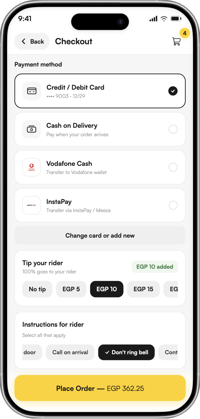
Cart abandonment spiked at the payment screen. Users wanted to pay with local methods like InstaPay or Vodafone Cash, but the UX in most apps forced them out of the flow with zero guidance.
03 · Blind Baskets
Users often forgot to add items because checking the basket meant navigating away from the catalog.
04 · The Budget-First Mental Model
In local Egyptian markets, shoppers frequently buy loose items by value rather than weight (e.g., “Give me 20 EGP worth of cheese,” instead of “Give me 500 grams”). Existing apps forced them into a frustrating guessing game of adjusting weights to hit their target budget.
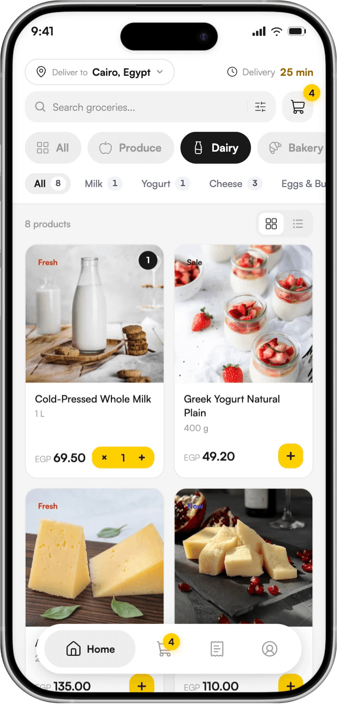
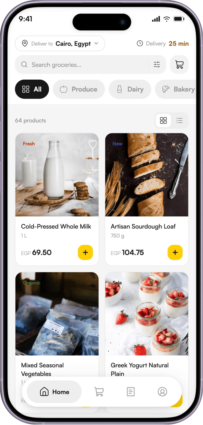
I stripped the catalog down to a breathable 60-30-10 color ratio, reserving the vibrant yellow strictly for conversion actions. To solve “The Tap Tax,” I introduced inline quantity steppers right on the product cards. The moment a user taps ‘Add’, it morphs into a stepper, and the basket badge updates instantly.

To support the local mental model discovered in research, I introduced a seamless toggle for applicable loose or weighted items. Users are no longer locked into buying by fixed quantities (Volume). They can switch to buy by ‘Value’, allowing them to simply input a specific currency amount (e.g., 20 EGP), and the system automatically calculates the corresponding weight. This brought the natural, physical market experience directly into the digital interface.
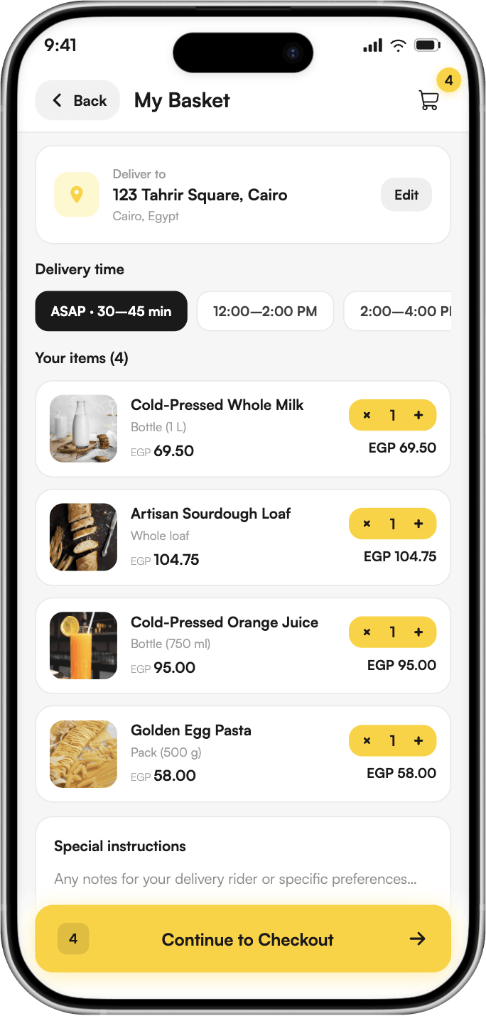
I designed the basket to be a single source of truth. Instead of a multi-page wizard, users can review items, adjust quantities, select a delivery slot, and add special instructions all on one scrolling view. For address entry, I integrated a fluid map picker that saves structured fields (Home, Work) to ensure precise deliveries in Cairo's complex neighborhoods.
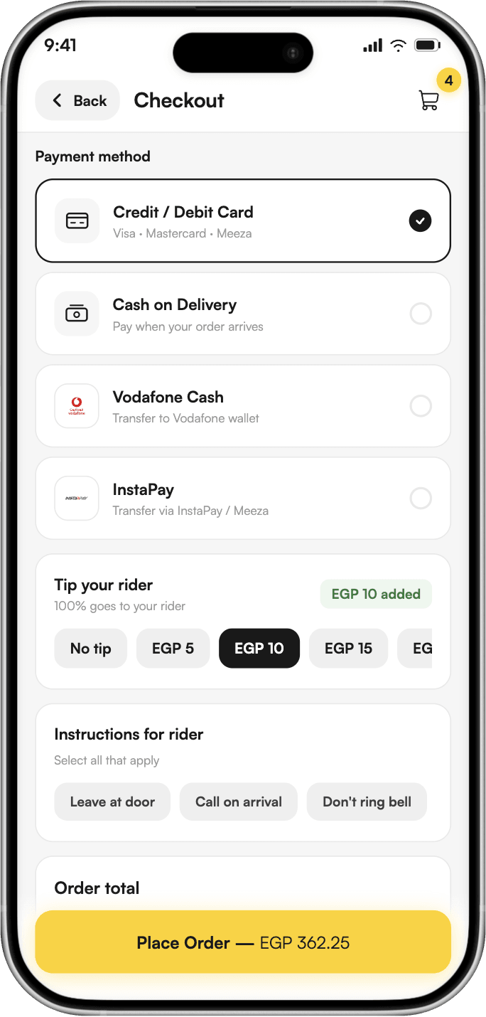
This is where most apps fail the Egyptian user. I completely redesigned the checkout to natively support how people actually pay here.
The last impression is the most important (The Peak-End Rule). Tapping “Place Order” triggers a seamless micro-interaction where the button morphs into a loading spinner, followed by a satisfying success state. It reassures the user that their task is done, giving them a clear ETA and tracking link.
By treating the grocery run as a single, fluid motion and solving hyper-local frustrations, the (tested) results were immediate:
34%
Reduction in time-to-checkout for returning users.
22%
Increase in successful checkout completions, largely driven by the frictionless InstaPay and Vodafone Cash flows.
18%
Increase in loose-item sales due to the new “Buy by Value” flexible purchasing feature.
Larger baskets
Significant drop in cognitive load, measured by users building larger baskets per session.